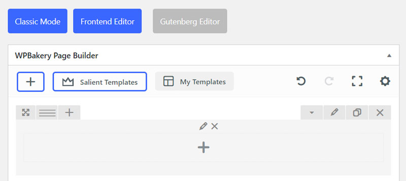
WP Bakery Page Builder Column Settings
General
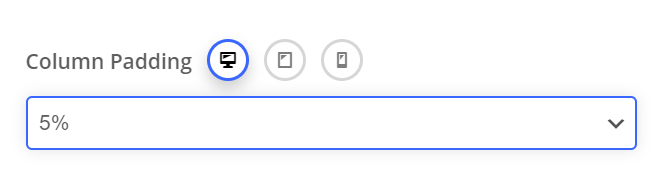
Padding
Allows you to define how much padding you would like from a percentage dropdown. Percentage values are used to keep everything responsive. Using padding will help give the content nested inside the column breathing room and allow the background layer of your column to show more.
Device Groups
The three icons next to the field name allow you to define separate values for the desktop/tablet/smartphone views.
Padding Position
The padding position dropdown allows you to add the padding to a specific side, or combination of sides on the column.
All Sides
Lorem ipsum dolor sit amet, consectetur adipiscing elit. Ut elit tellus, luctus nec ullamcorper mattis, pulvinar dapibus leo.
Top/Bottom
Lorem ipsum dolor sit amet, consectetur adipiscing elit. Ut elit tellus, luctus nec ullamcorper mattis, pulvinar dapibus leo.
Left/Right
Lorem ipsum dolor sit amet, consectetur adipiscing elit. Ut elit tellus, luctus nec ullamcorper mattis, pulvinar dapibus leo.
Margin
Allows you to create space around a column by a specific margin (top,bottom,left,right) of your choosing. Negative values are also accepted and can be used to pull columns outside their default flow.
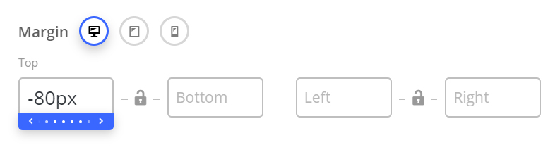
60px Top Margin
Lorem ipsum dolor sit amet, consectetur adipiscing elit. Ut elit tellus, luctus nec ullamcorper mattis, pulvinar dapibus leo.
No Margin
Lorem ipsum dolor sit amet, consectetur adipiscing elit. Ut elit tellus, luctus nec ullamcorper mattis, pulvinar dapibus leo.
Centered Content
The centered content option is a fast way to center all text and inner elements of a column. Note: Certain elements will not respond to this option – in those cases, the elements will have their own settings for alignment.
Centered Content Enabled
Lorem ipsum dolor sit amet, consectetur adipiscing elit. Ut elit tellus, luctus nec ullamcorper mattis, pulvinar dapibus leo.
Centered Content Disabled
Lorem ipsum dolor sit amet, consectetur adipiscing elit. Ut elit tellus, luctus nec ullamcorper mattis, pulvinar dapibus leo.
Column Link
Adds a link over your entire column to your specified URL.
Responsive Options
The Responsive Options tab, located in the column edit window, allows you to define the width of content columns for each viewport (from desktop to mobile). These variables are controlled by Width and Offset.
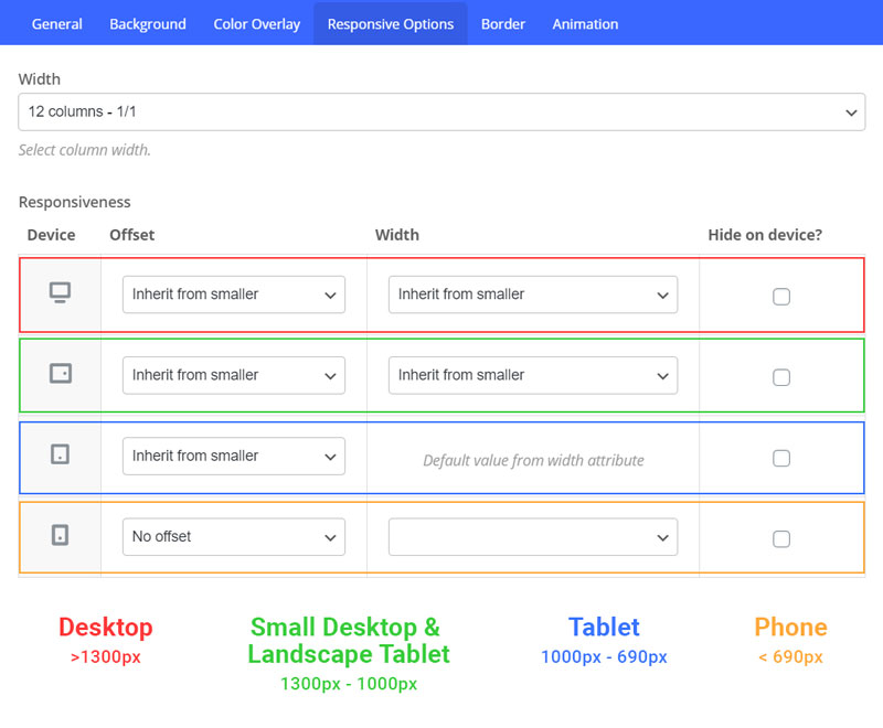
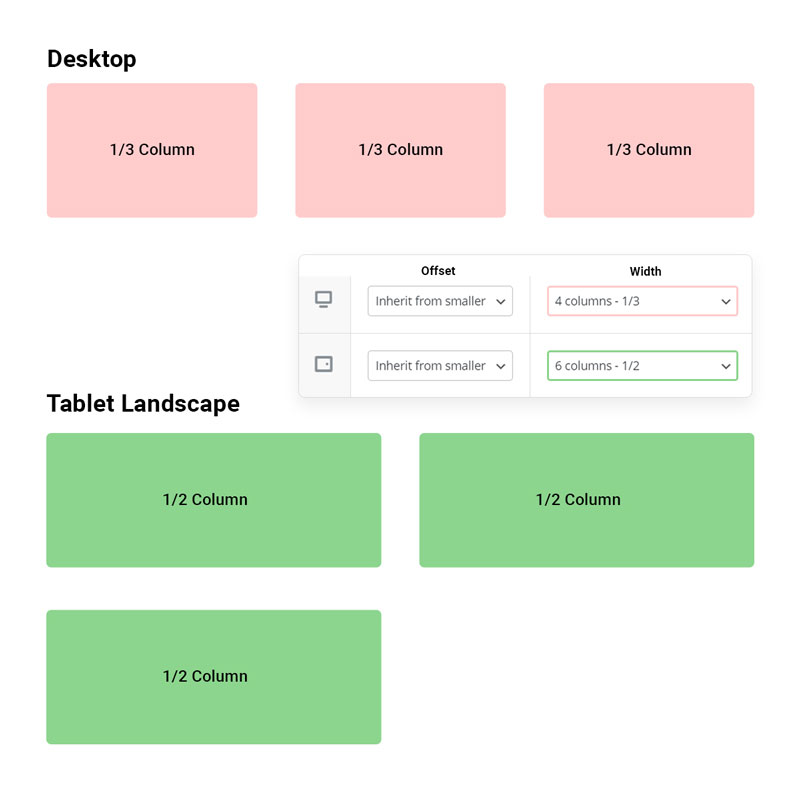
Width
Width controls the number of columns and how they will display in a row. The number of columns in a row you can display is divisible by 12. The examples below show that when the width is set to 4 columns, your 3 columns will be shown on one row because you are setting each column to be 4 columns in width, 4/12 = 1/3 size columns. The next example shows columns will stack when you set columns to be wider. For example, if you set the width to 12 columns, the content in each column will display the full width of the row, then stack on top of each other. The overflow will, by default, align left which is where the offset option is utilized.
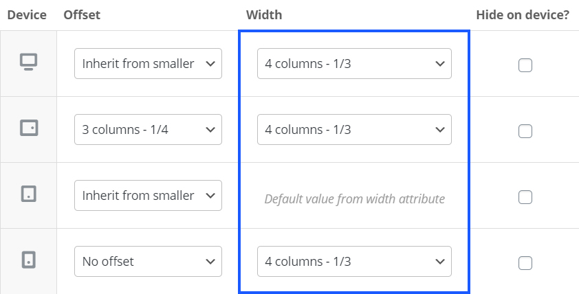
Offset
The offset option will work similarly to the width by using the 12-column measurement to move the overflow columns by the set amount. In the example below, you can see the number of columns selected will represent the gap given before the content; 3 columns representing a ¼ of the row width.
The last option to mention is the tick box to the side of the viewports which gives the option to hide the column for the chosen view port.
Hide On Device
This option allows you to hide a column from displaying on a given viewport. The column will be hidden using CSS and still exist within the HTML structure.
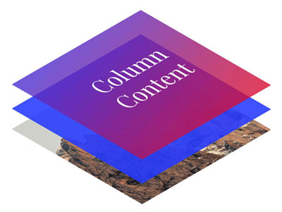
Background
Background Layers
The stacking order for the background layer can be seen in the illustration below.
- Elements place inside the column (top)
- Color Overlay Layer
- Background Color
- Background Image/Video Layer (bottom)
Background Image
You can add a background image to any column by using the “Upload image” button in the background tab of your column settings. Once an image is supplied, some new options will appear which relate to the display of your background image.
- Background Position: Define an alignment for your background image within the row. By default, the image will be anchored to the left top of the row.
- Scale Background Image To Column: Automatically adjusts the image to fit the size of your column. This option is recommended in most cases, unless If you’re trying to use a pattern that is meant to repeat.
Scale Background Image Disabled
Lorem ipsum dolor sit amet, consectetur adipiscing elit. Ut elit tellus, luctus nec ullamcorper mattis, pulvinar dapibus leo.
Scale Background Image Enabled
Lorem ipsum dolor sit amet, consectetur adipiscing elit. Ut elit tellus, luctus nec ullamcorper mattis, pulvinar dapibus leo.
Video Background
- WebM File URL: If you’re self hosting, you must supply this format to ensure cross browser compatibility.
- MP4 File URL: If you’re self hosting, you must also supply this format to ensure cross browser compatibility.
- OGV File URL: Optional file format to supply for self hosting
- Video Preview Image: The image that will be used in place of your video BG on mobile devices. This is only used when you have the Salient theme option “Disable Video Backgrounds On Mobile Devices” activated. (Salient options panel > general settings > functionality tab).
Background Colour
In columns, the background color layer sits on-top of the background image. This is to provide the ability to animate the opacity on hover over the image.
Background Colour
- Opacity: 1
- Hover Opacity: 1
Background Colour
- Opacity: 0.5
- Hover Opacity: 0.5
Background Colour
- Opacity: 0.8
- Hover Opacity: 0.4
Colour Overlay
Gradient Overlay
Enable this to cause the color overlay layer to use both the “Color Overlay” and “Color Overlay 2” color pickers. A gradient will be formed in between the colors in the direction that you specify via the “Gradient Direction” dropdown.
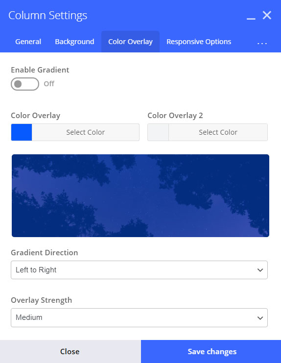
Overlay Strength
Controls the opacity in which your overlay will show on top of the lower background layers (image/video).
- Light: Opacity 0.3
- Medium: 0.5
- Heavy: 0.8
- Very Heavy: 0.95
- Solid: 1.0
Gradient Direction
Controls which way to render the gradient – A preview will be shown in the overlay tab.
Left to Right
Left Top to Right Bottom
Left Bottom to Right Top
Bottom to Top
Animation
Background Image Animation
The background image animation option allows you to define an animation that will apply only to the image you’ve specified for your column background image. The animation selected will only trigger one time, when the user scrolls the row into the viewport.
Fade In
Zoom Out
Zoom Out Reveal
Zoom Out Slowly
Entire Column Animation
As the name implies, this option will animate the entire column, including all layers its contents. This animation will also only trigger one time, when the user scrolls the row into the viewport.
As of Salient version 12, you can now have your elements animate on mobile as well. To enable this functionality, head to the Salient > general settings > functionality, and change the option titled Page Builder Element Animations On Mobile Devices to Enable.icon
Fade In
Fade In From Left
Fade In From Right
Fade In From Bottom
Grow In
Zoom Out
Slight Twist
Flip In Horizontal
Flip In Vertical
Reveal From Right
Reveal From Left
Reveal From Bottom
Reveal From Top
Column Animation Delay
The animation delay property will delay your column animation from occurring for the specified amount of time in milliseconds. This can be used to create staggering animations.
Delay: 0
Delay: 250
Delay: 500
Delay: 750
Delay: 1000
Delay: 1250
Advanced
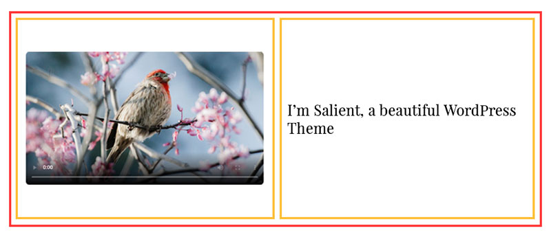
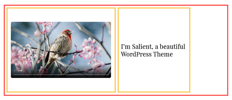
Maximum Width
The maximum width field allows you to define a custom width that the column will not display greater than. This can be useful in limiting the amount of space text can flow.
The maximum width attribute allows you to define values based in pixels (px), percent (%), or viewport (vw). Take a look at the illustrated example below. The red border denotes a page builder row, and the yellow borders denote page builder columns.
Column maximum width left blank (default)
Column maximum width set to 300px
Z-Index
Allows you to define a custom stacking order for your column. This can come in handy when you have a setup in which columns overlap and you want to specify which column will display on top.
Extra Class Name
Allows you to specify custom CSS class names that will be applied to your column. This is useful for when you need to target a specific column for additional CSS tweaking.