WP Bakery Page Builder Row Settings
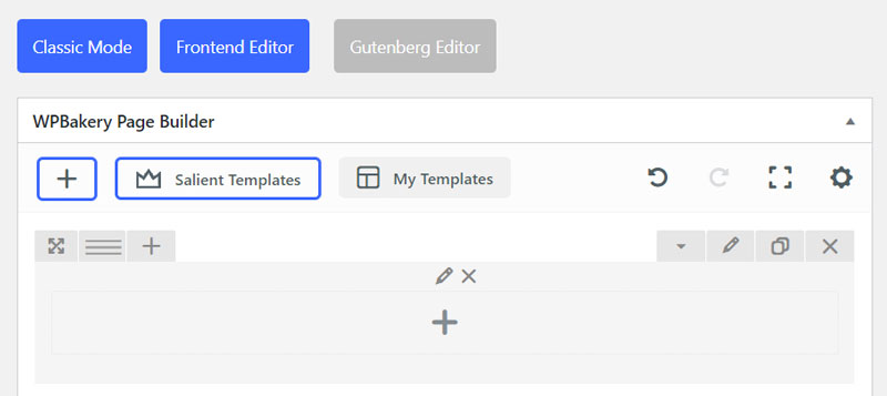
Structure
Row type
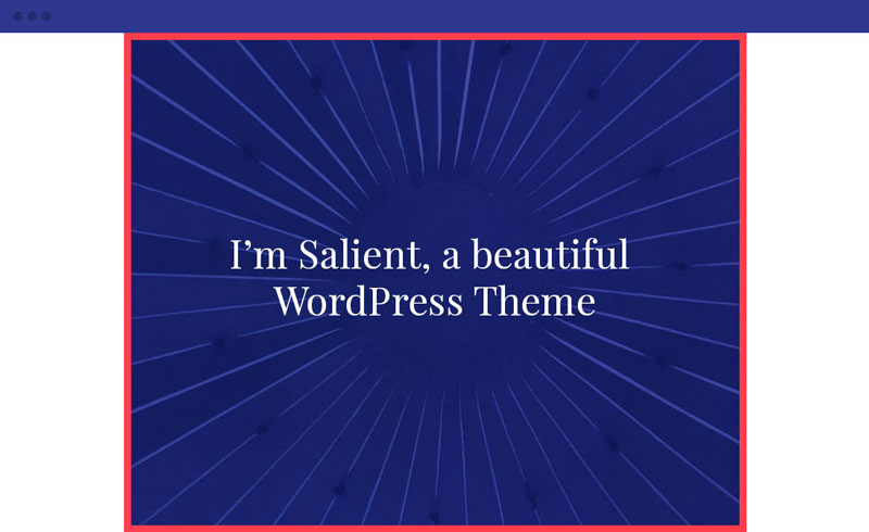
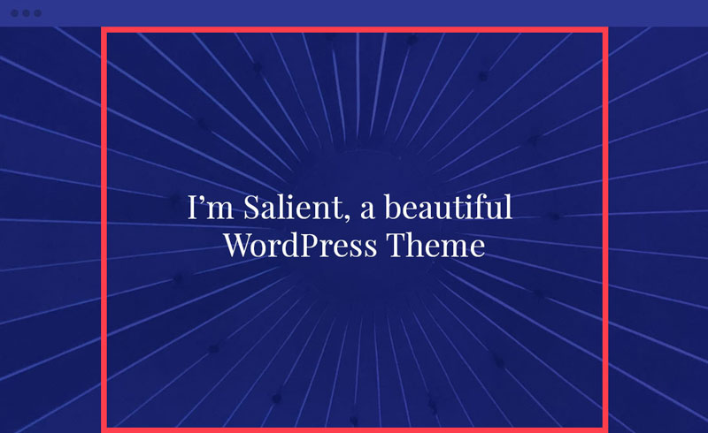
The row type will control the sizing of your row content and row background layers. Below we will compare each of the available row types. The red highlight is a representation of the content area.
Row Type: In Container
The in container row type will constrain the background layer as well as the content. This row type also adds a small bit of bottom margin by default, so if you’re looking to make your rows flush against each other, use one of the other two types.
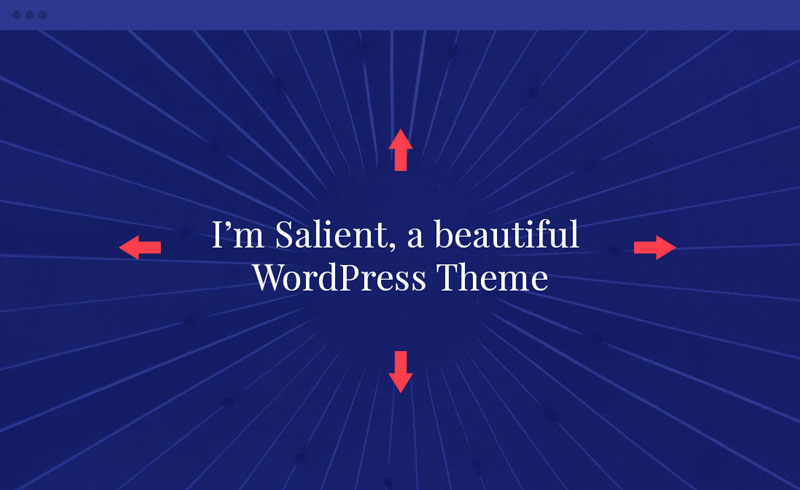
Row Type: Full Width Background
This row type allows the background supplied for the row to stretch to the edges of the browser window, but keeps the content inside constrained in the main content container.
Row Type: Full Width Content
This is a row set to the “Full Width Content” type with a background color. It allows both the row background and any content inside it to display the full width of the browser window.

Column Margin
The column margin allows you to define the amount of spacing between each of the columns in your row.
20px Margin
Lorem ipsum dolor sit amet, consectetur adipiscing elit. In eget eros molestie, iaculis.
20px Margin
Lorem ipsum dolor sit amet, consectetur adipiscing elit. In eget eros molestie, iaculis.
20px Margin
Lorem ipsum dolor sit amet, consectetur adipiscing elit. In eget eros molestie, iaculis.
50px Margin
Lorem ipsum dolor sit amet, consectetur adipiscing elit. In eget eros molestie, iaculis.
50px Margin
Lorem ipsum dolor sit amet, consectetur adipiscing elit. In eget eros molestie, iaculis.
50px Margin
Lorem ipsum dolor sit amet, consectetur adipiscing elit. In eget eros molestie, iaculis.
80px Margin
Lorem ipsum dolor sit amet, consectetur adipiscing elit. In eget eros molestie, iaculis.
80px Margin
Lorem ipsum dolor sit amet, consectetur adipiscing elit. In eget eros molestie, iaculis.
80px Margin
Lorem ipsum dolor sit amet, consectetur adipiscing elit. In eget eros molestie, iaculis.
80px Margin
Lorem ipsum dolor sit amet, consectetur adipiscing elit. In eget eros molestie, iaculis.
Equal Height
Allows you to keep the columns within your row at an equal height regardless of how much content is in them. You can also choose how the shorter content will be aligned (top (default), middle, bottom).
Equal Height Enabled
Lorem ipsum dolor sit amet, consectetur adipiscing elit. Aenean ac ex a enim dapibus imperdiet. Morbi laoreet ipsum vitae suscipit consectetur. Suspendisse varius nulla id augue imperdiet, ac luctus purus fringilla. Sed accumsan tristique nunc eget tincidunt. Phasellus tincidunt elementum pharetra. In et tincidunt lorem.
Lorem ipsum dolor sit amet, consectetur adipiscing elit. Aenean ac ex a enim dapibus imperdiet. Morbi laoreet ipsum vitae suscipit consectetur. Suspendisse varius nulla id augue imperdiet.
Equal Height Disabled
Lorem ipsum dolor sit amet, consectetur adipiscing elit. Aenean ac ex a enim dapibus imperdiet. Morbi laoreet ipsum vitae suscipit consectetur. Suspendisse varius nulla id augue imperdiet, ac luctus purus fringilla. Sed accumsan tristique nunc eget tincidunt. Phasellus tincidunt elementum pharetra. In et tincidunt lorem.
Lorem ipsum dolor sit amet, consectetur adipiscing elit. Aenean ac ex a enim dapibus imperdiet. Morbi laoreet ipsum vitae suscipit consectetur. Suspendisse varius nulla id augue imperdiet.
Column Direction
Controls the direction the columns will flow on the page. This option can be set to a different value for desktop/tablet/smartphone displays.
Standard Direction
First column
Mauris blandit aliquet elit, eget tincidunt nibh pulvinar a. Curabitur non nulla sit amet nisl tempus convallis quis ac lectus.
Second column
Mauris blandit aliquet elit, eget tincidunt nibh pulvinar a. Curabitur non nulla sit amet nisl tempus convallis quis ac lectus.
Third column
Mauris blandit aliquet elit, eget tincidunt nibh pulvinar a. Curabitur non nulla sit amet nisl tempus convallis quis ac lectus.
Reversed
First column
Mauris blandit aliquet elit, eget tincidunt nibh pulvinar a. Curabitur non nulla sit amet nisl tempus convallis quis ac lectus.
Second column
Mauris blandit aliquet elit, eget tincidunt nibh pulvinar a. Curabitur non nulla sit amet nisl tempus convallis quis ac lectus.
Third column
Mauris blandit aliquet elit, eget tincidunt nibh pulvinar a. Curabitur non nulla sit amet nisl tempus convallis quis ac lectus.
Full Height Row
This will cause your row to automatically scale to the height of the browser window. When using this option, there’s no need to set any padding for the top/bottom of your row, as doing so will increase the height of your row beyond the height of the browser window.
Spacing & Content
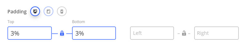
Padding
The padding fields will accept standard numerical values such as “100” to use a px, or will accept % based values, such as 10%. Using padding will help give the content nested inside the row breathing room and allow the background layer of your row to show more.
Device Groups
The three icons next to the field name allow you to define separate values for the desktop/tablet/smartphone views.
Lock Icon
Locking the top/bottom or left/right fields together will ensure that their values remain the same for easy proportional editing.